
7 Mistakes You're Making with Earthy Color Palettes (and How to Fix Them)
- Mathias Isaac
- Sep 2, 2025
- 5 min read

Earthy color palettes have become the go-to choice for homeowners seeking that perfect balance of warmth, sophistication, and timeless appeal. From rich terracottas to soft sage greens, these nature-inspired hues promise to create serene, grounding spaces that feel both modern and enduring. But here's the thing: even the most beautiful earthy palette can fall flat when common design mistakes creep in.
After working with countless clients on their interior design projects, I've noticed the same seven mistakes happening again and again. The good news? They're all completely fixable with the right approach. Let's dive into what's going wrong and how you can get your earthy palette back on track.
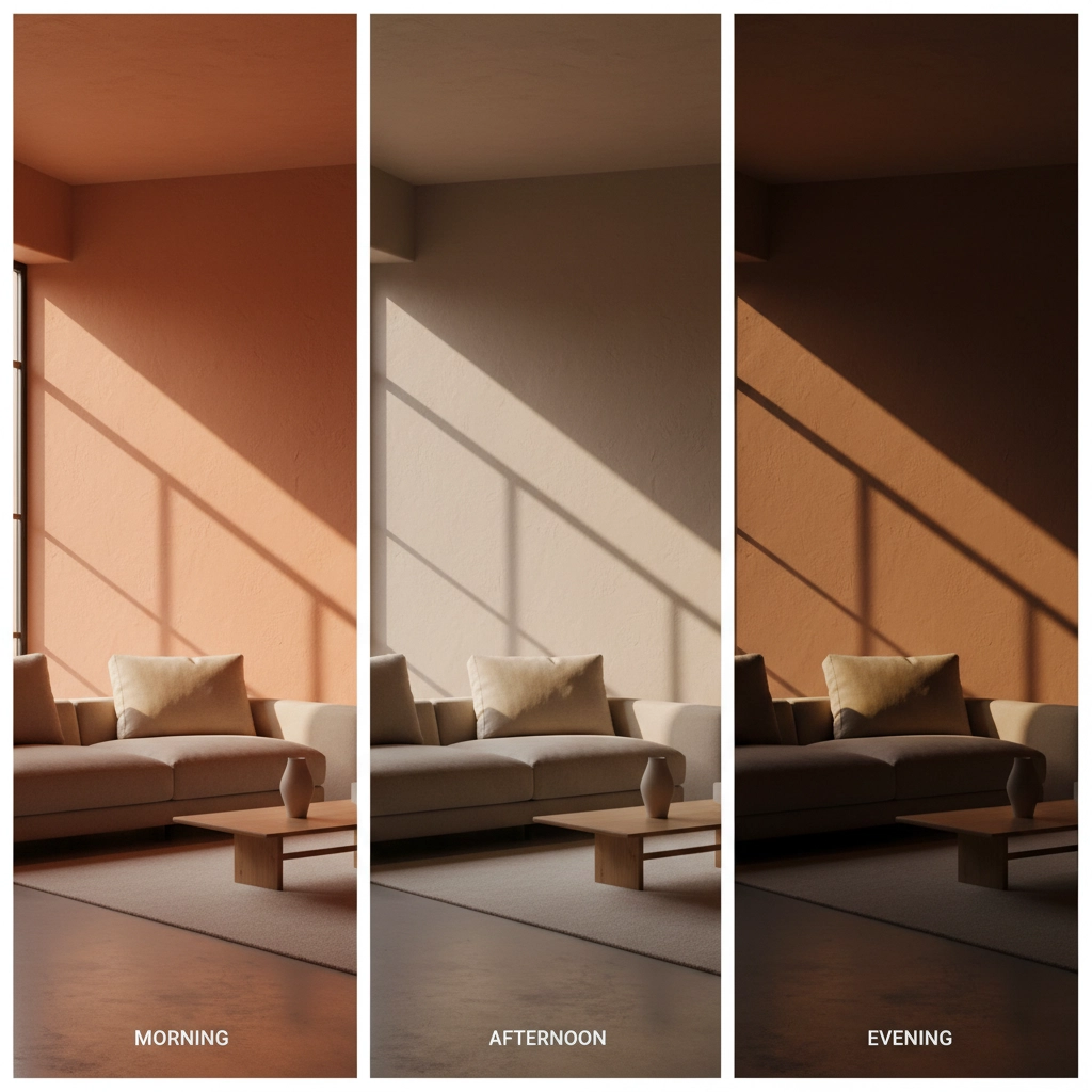
1. Ignoring How Natural Light Transforms Earthy Colors
This is the mistake I see most often, and it's a big one. That gorgeous mushroom grey you fell in love with at the paint store? It might look completely different in your north-facing living room. Earthy colors are particularly sensitive to lighting changes because they contain complex undertones that shift dramatically throughout the day.
The Fix: Always test your colors in the actual space before committing. Paint large swatches (at least 2x2 feet) on different walls and observe them at various times of day. South-facing rooms with abundant natural light can handle deeper earth tones like forest greens and burnt siennas. North-facing spaces need warmer earthy hues: think golden ochres and warm chestnuts: to counteract the cooler, indirect light. For rooms that experience dramatic lighting changes throughout the day, stick with more adaptable neutral earth tones like warm whites and soft taupes.
2. Mixing Warm and Cool Earth Tones Without a Strategy
Just because colors are all "earthy" doesn't mean they'll automatically work together. I've walked into homes where warm terracotta walls clash with cool sage furniture, creating a space that feels disjointed despite using colors from the same natural family.
The Fix: Choose a dominant temperature direction for your palette: either predominantly warm or cool. If you want to incorporate both (and you absolutely can), use neutral bridges like mushroom greys, warm whites, or soft taupes to create harmony. Natural materials like reclaimed wood, jute, or stone work beautifully as temperature bridges too, helping warm and cool earth tones coexist peacefully.
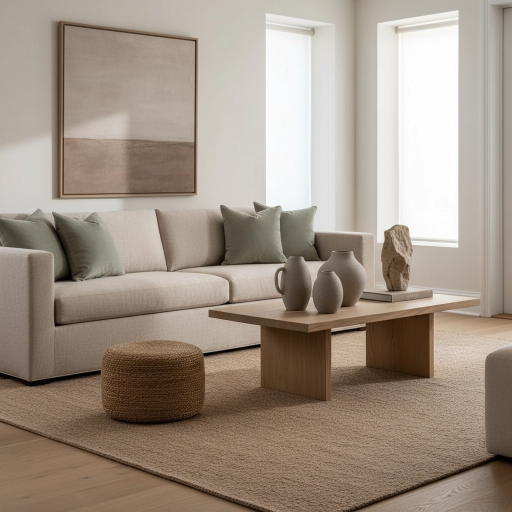
3. Creating a Muddy Mess with Poor Color Proportions
Here's where the 60-30-10 rule becomes your best friend. Too many people treat all colors in their earthy palette as equals, leading to spaces that feel chaotic or, worse, muddy and undefined.
The Fix: Use your most neutral earth tone (like cream or warm white) for about 60% of the space: walls, larger furniture pieces, and major textiles. Your secondary earth color (perhaps a soft sage or warm ochre) should cover roughly 30% through medium-sized furniture, accent walls, or substantial decor pieces. Save your boldest earthy accent: that gorgeous deep forest green or burnt orange: for just 10% of the space through pillows, artwork, and smaller accessories.
4. Forgetting About Contrast and Visual Depth
I get it: earthy palettes are meant to be calming. But when you stick only to mid-tone earth colors, you end up with a flat, one-dimensional space that lacks personality and visual interest.
The Fix: Every successful earthy palette needs both lighter and darker elements to create depth. Pair creamy whites with deep charcoal browns, or combine pale sage with rich forest green. Don't forget textural contrast either: smooth ceramics against nubby linen, sleek wood against rough-hewn stone. This variety keeps the eye engaged while maintaining that serene, earthy vibe you're after.
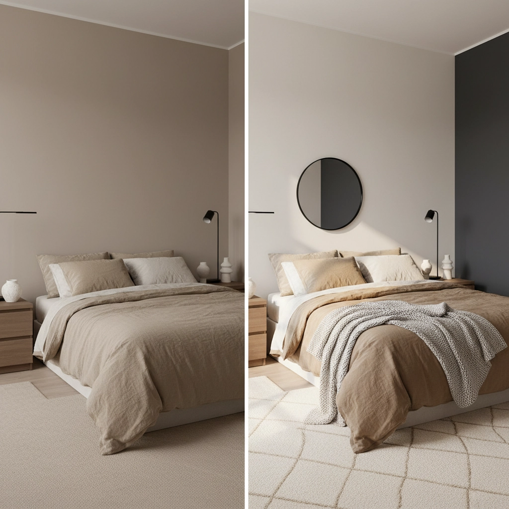
5. Going Too Dark Too Fast
Dark earthy colors like deep chocolate brown, charcoal, and forest green are absolutely stunning: but they can quickly overwhelm a space when used without restraint. I've seen beautiful rooms transformed into cave-like spaces because the homeowner fell in love with dramatic dark earth tones and used them everywhere.
The Fix: Use dark earth tones strategically as accent colors rather than dominant hues. Try them on a single feature wall, built-in bookcases, or one major furniture piece while keeping the majority of surfaces in lighter earth tones. Always ensure you have adequate lighting: both natural and artificial: to prevent dark colors from making the space feel cramped or oppressive.
6. Ignoring Your Home's Existing Architecture
Your earthy palette should enhance your home's bones, not fight against them. I've seen gorgeous color schemes fail simply because they didn't complement the existing architectural elements.
The Fix: Take inventory of your permanent features: wood trim, stone fireplaces, brick walls, tile floors. If you have warm wood elements, lean toward warmer earth tones like golden ochre, rust, and warm browns. For spaces with cool stone or concrete features, cooler earth tones like slate grey, sage green, and mushroom will feel more harmonious. When in doubt, choose colors that have similar undertones to your existing materials.
7. Not Considering the Room's Purpose and Mood
This is where functionality meets beauty. Not every earthy color works in every space, and choosing colors without considering how you want to feel in each room can undermine the space's effectiveness.
The Fix: Match your color choices to each room's intended use. For energizing spaces like kitchens and home offices, choose lighter, more uplifting earth tones: creamy whites, soft yellow-greens, and warm taupes that promote alertness and focus. For relaxing spaces like bedrooms and living rooms, deeper earth tones like sage, soft browns, and muted terracottas create the calming atmosphere you're after. Ask yourself: "How do I want to feel in this space?" and let that guide your color selection.
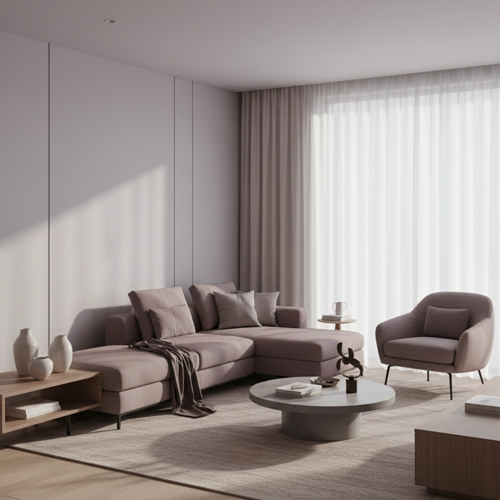
The Future Dusk Phenomenon
Speaking of earthy palettes, there's a reason everyone's talking about "Future Dusk" colors right now. These sophisticated greyish-purples with earthy undertones represent the perfect evolution of traditional earth tones: they're grounding like classic earth colors but with a modern, forward-thinking edge that feels both timeless and contemporary.
Future Dusk colors work beautifully within earthy palettes because they bridge the gap between cool and warm undertones naturally. Think soft lavender-greys, muted purple-browns, and sophisticated mauve-taupes. These colors avoid many of the common mistakes we've discussed because they're naturally balanced and work well in various lighting conditions.
Bringing It All Together
The beauty of earthy palettes lies in their ability to create spaces that feel both sophisticated and approachable, modern and timeless. When you avoid these seven common mistakes, you're well on your way to creating a home that truly feels like a sanctuary.
Remember, the best earthy palettes don't just look good in photos: they feel right for the people living in them. Consider your lifestyle, your home's architecture, and how you want each space to function. Whether you're drawn to warm terracottas and golden ochres or prefer the cooler side with sage greens and soft greys, the key is implementing these colors thoughtfully and strategically.
At De Blueprint, we've seen firsthand how the right earthy palette can transform not just a space, but how people feel in their homes. When done well, these nature-inspired colors create the perfect backdrop for life: calm enough to relax in, sophisticated enough to entertain in, and timeless enough to love for years to come.
Ready to perfect your earthy palette? Take a fresh look at your space with these seven mistakes in mind. You might be surprised at how a few strategic adjustments can elevate your entire design scheme.

Comments